Royal Enfield
Make It Yours
Visit Website
Royal Enfield motorcycles are synonymous with customization. Riders can personalize their machines to perfectly match their style and needs. This deep-rooted passion for individuality presented a product design opportunity: the 'Make It Yours' program. This program empowers new buyers to design the motorcycle of their dreams, meticulously selecting the features and details that define their ideal ride.

Role
After rolling a beta version of Royal Enfield's configurator, we were given the task of redesigning it. We had the advantage of going through previous research and accessing analytical results about: user exit points, sections that generated problems, most used customisation etc. We worked along the leadership, product and engineering teams to re-design the platform.
Problem
Friction within the configuration experience prevented users from committing to a sale.
Through previous interviews we figured that customers who are considering an expensive purchase, needed good number of “exploration” sessions. We noticed that the current configurator suffered from poor navigation and problematic sections, making it difficult to explore different product/accessories offerings. This lead to a frustrated customers frequently abandoning at checkout.
Empathy
Motorcycle configurators serve two main purposes: sparking product exploration and enabling customization for individual needs. Royal Enfield's core customer seeks a motorcycle that reflects their personality, making customization a key factor.

Goal
By narrowing down the preferences of our target audience, Raghu in this case, we were able to concentrate on the primary goal,
Enable effortless exploration & customisation, driving confident purchases.
User Journey
We mapped out the specific steps that Raghu takes on our product to achieve his goal. In other words, how Raghu moves from page to page on our website to buy a motorcycle.
-
Visit the app or website
-
Browse categories (Motorcycle, Variants)
-
View product details (images, info, price)
-
Configure product (choose a size, color, etc)
-
Add product to cart
-
Complete checkout
-
Receive confirmation

We knew from research that users were most likely exiting between Step 3 and Step 5. So we focused on improving these areas.
Approach
During brainstorming, we asked ourselves the following relevant questions that gave us a clear picture of the features we wanted to prioritise.
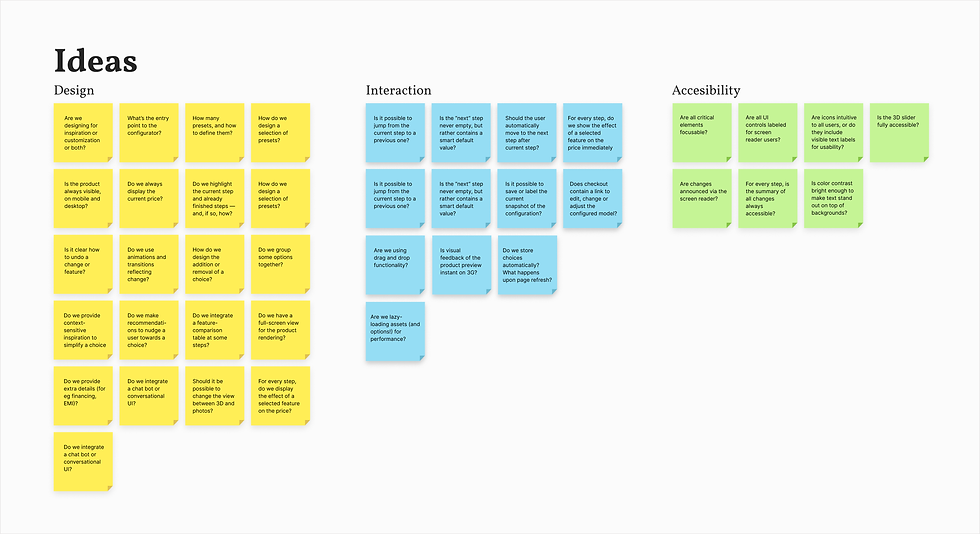
For eg: Asking ourselves the question of whether the product is always visible on mobile and desktop, led us to re-think about the real-estate of the main configuration page.
Configurators are usually quite tall and wide, partly due to the spacious 3D view they are likely to contain. With navigation, prices and configuration controls to operate, a configurator view usually takes up the entire screen, especially on mobile. That’s why a configurator usually lives on a standalone page. So planning this real-estate became crucial.

Real estate planning
Likewise, as we progressed with our ideas, we began creating low-fidelity wireframes to visualise potential solutions.

Wireframing the solutions
Branding and Visual Design
Royal Enfield boasts a powerful brand identity that resonates deeply with its users. We ensured our redesign adhered to existing brand guidelines to maintain this strong association.

While the website and app offered detailed product pages for in-depth exploration, we also implemented a user-friendly feature for quick browsing and comparison. This involved a neat list showcasing all motorcycle models and their variants. Additionally, prioritising best-selling models like "Classic" at the top of the list allows users to reach the configuration stage faster.

Model and Variant selection
With a handful of options to choose from, a blank canvas might work, but for anything slightly more advanced, defining a reasonable starting point encouraged exploration.
Prioritising User Needs: The navigation is designed with user needs in mind. We've grouped motorcycle parts into four intuitive categories: Style, Comfort, Safety, and Personalisation. This categorisation reflects how riders typically approach customisation, making it easy to find the parts they're looking for.
Streamlined Exploration: Within each category, a drill-down approach allowed further exploration. User data showed that color is often the starting point for customisation, especially within "Style." Leveraging this insight, we pre-selected a default color (black, based on user data), subtly nudging users towards this popular choice. This streamlined the process, catering to typical user behavior.

Make It Yours Configurator

This categorisation aligned perfectly with how users typically approach motorcycle customisation, making it a easy to find the parts they're interested in. Visual cues like icons and images, along with clear cost information, further enhance usability and create an intuitive experience. To cater to the user's desire for self-expression and individuality, we included subcategories like "Personalised Badges" and "Name Plates."

The price updated real-time and was conveniently positioned to be readily available throughout the customisation process. This eliminated the need for excessive scrolling or switching screens, reducing cognitive load for users. The price break-up view allowed users to understand the cost impact of each customisation option they choose.

Price Break-up
The configurator also enabled users to save their customised motorcycle configurations at any point. Users could experiment with different options, come back later and pick up exactly where they left off, fostering a more relaxed, exploratory experience.

Save Configuration or Checkout
Learning
This project has been a huge learning opportunity. Data showed that the conversion improved with the launch of the updated configurator. There were fewer abandoned carts and the time spent on configurators also increased significantly.
After running a few light experiments, we noticed a couple of glitches. We hypothesised that the although the configurator became more interactive and intuitive for the user, slow visual feedback and load time were still preventing users from having a smooth experience.
Next step was to further enhance the performance of the configurator with close collaboration with the engineering team.

Credits
The teams
Design Lead
Product Lead
Head of Digital

To ensure that all 120+ million users experience the same brand value. View Project
Differentiating JioSaavn's music discovery experience View Project
